Key Takeaways
- The abstract's last one or two sentences usually contain the paper's real claim, so start there instead of reading front to back.
- A results table with no error bars or seed count reported might reflect one lucky run rather than a reliable improvement.
- The limitations section is often the most candid paragraph in a paper because the selling job is already done by the time authors write it.
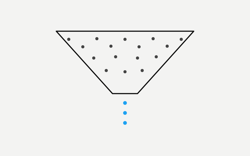
Most people who open an AI paper for the first time give up somewhere around the notation in section three, convinced they have hit a wall that requires a doctorate to climb. They have not. The part of a machine learning paper that actually carries the claim, what was tried, what happened, and how much of it you should believe, is almost always written in plain English, and it is concentrated in maybe three sections you can locate without reading the rest. The math is real, but the math is rarely where an outside reader gets misled. The misleading happens in the gap between what a paper's framing implies and what its own numbers show, and closing that gap does not require a technical background. It requires a method.
This is not a guide to backpropagation or attention mechanisms. It is a guide to reading the way a skeptical editor reads a pitch: in a deliberate order, fast, with one question running underneath everything, namely what exactly are you claiming, and where is the evidence for it. At GLSRM we work through a version of this stack of papers every day, because separating real signal from confident restatement is most of the job. Here is the order we actually use, and the specific things we check at each stop.
The Abstract Is a Sales Pitch, Read It Like One
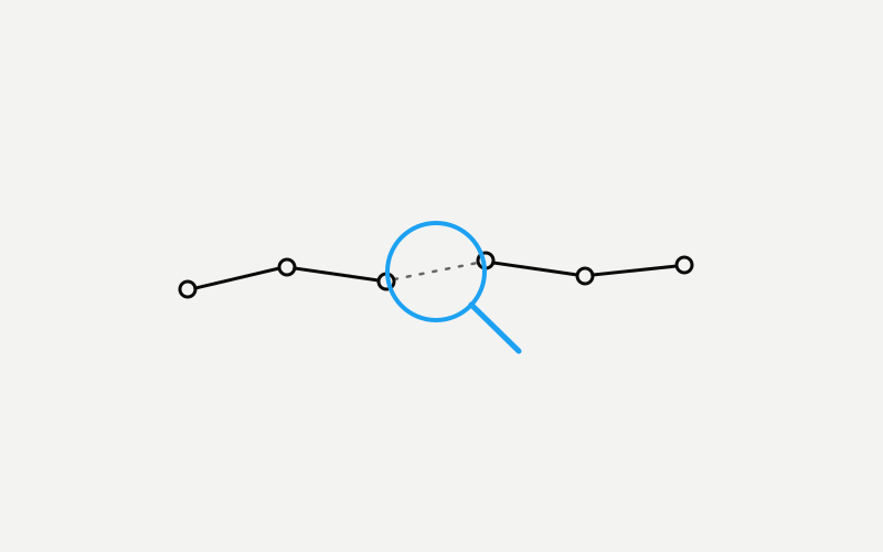
Every ML abstract follows roughly the same shape: a sentence or two of motivation that restates a problem everyone already agrees is a problem, a middle stretch describing what the authors actually built or tried, and then, almost always in the final one or two sentences, the actual claim. That last part is the whole paper compressed into a single comparison, and it is where you should start reading, not where you should finish. Skip to the end of the abstract first. If it does not contain a specific comparison, an improvement over a named baseline, on a named benchmark, by a stated margin, that absence is information too. Vague abstracts often sit on top of vague results.
Watch the adjectives. Words like "significantly," "dramatically," or "substantially" floating without a number nearby are doing rhetorical work that the data may not support a few pages later. A strong result tends to just state itself plainly, because the authors do not need the adjective to carry weight the number already carries. And when you do see the number, check what it is dated against: state of the art is a claim about a specific moment against a specific list of competing systems, and in a field that moves this fast, a true state-of-the-art claim on submission day can be three rungs down the ladder by the time you are reading it. That is not the authors' fault. It is just a reason to treat the phrase as a timestamp, not a permanent rank.
Skip the Introduction, At Least on the First Pass
The introduction mostly exists to justify the paper's right to exist to a skeptical reviewer, a longer restatement of the abstract plus a tour of the field meant to establish that this specific gap has not been filled yet. The related work section that usually follows is even less essential to you: it is largely a citation courtesy, a map of who the authors are being polite to, not a summary you need in order to evaluate the claim. You can skip both on a first pass and lose almost nothing that matters to the question you actually came with.
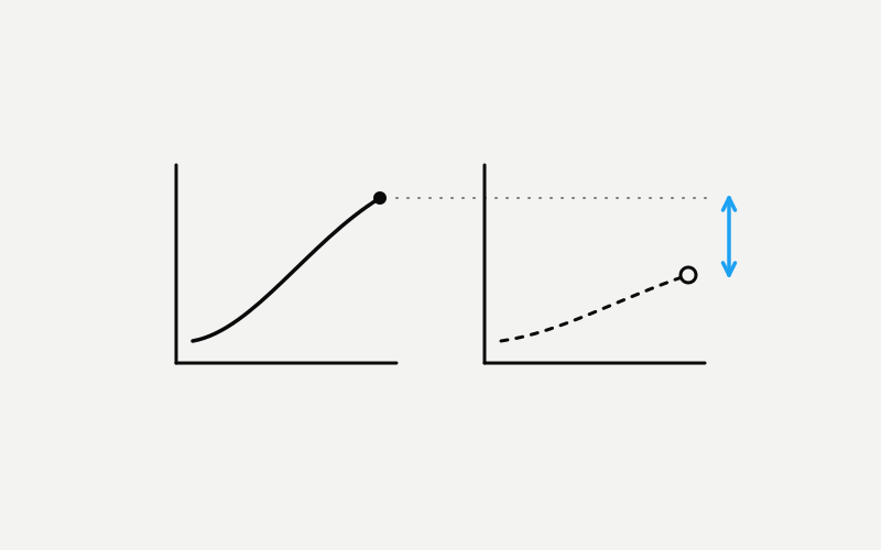
Go straight to the results instead, specifically to whatever the paper calls Figure 1, because in most modern papers that single chart is designed to be the entire argument in one image. Treat it exactly the way you would treat a headline chart in an investor deck: it was chosen to be shown, not sampled at random from everything the authors tried, and the axes, the baselines included, and the framing were all editorial decisions before they were scientific ones. After that, read the limitations section, which we will get to below. Only after both of those should you circle back to the method section, and only if the result surprised you enough to want to know how they actually got there.
The Table Is the Truth, and the Trap
Results tables are where papers are won or lost, and also where a casual read gets fooled most easily. The bolded numbers mark the row the authors want your eye to land on, and that is layout, not evidence. Read the whole row and the whole table before trusting the bold. Ask what is being compared against: a fair, current, strong baseline, or a version quietly weakened to make the gap look bigger. Ask whether a competing system that existed at submission time is conspicuously missing. A narrow comparison set is one of the more reliable tells that a wider one would not have told the same story.
Then look for variance. A single number with no error bar, no standard deviation, and no mention of how many random seeds were run might be one lucky pass through a noisy process rather than a reliable improvement. Some benchmarks wobble by a few points between runs of the exact same method, which means a paper reporting a two-point gain with no variance reported has not actually shown you anything you can rely on. It has shown you one roll of the dice that happened to land favorably. Papers worth your trust tend to volunteer this information without being asked, because reporting variance is itself a signal that the authors ran the experiment enough times to know what the variance actually is.
Limitations Sections Are Where Authors Tell You What They Really Found
Read this section before you decide whether the abstract's claim survives contact with reality. Limitations paragraphs are written under a different incentive than the rest of the paper. The selling job is largely done by the time authors get there, and what is left is closer to professional self-preservation, since a reviewer who catches an undisclosed limitation is a harsher critic than one who reads an honestly disclosed one. That flip in incentive tends to produce the most candid writing in the entire document.
This is where you will find the lines that quietly narrow a sweeping abstract into something much smaller and much more honest: results that only hold on English text, a method that stops working past a certain input length, an evaluation run in a single-turn setting that says nothing about how the system behaves across a real extended conversation. None of that makes the paper worthless. It just means the true scope of the claim usually lives here, three-quarters of the way through a document most readers never reach, rather than in the sentence everyone actually goes on to quote.
The Appendix Deserves One Scroll, Even If You Skip Everything Else
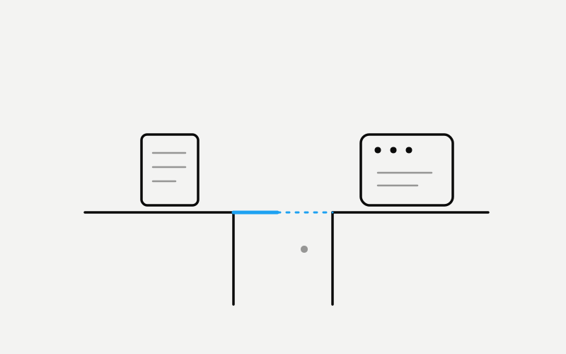
Appendices have a bad reputation as the place papers dump material a reviewer forced them to include, and that reputation is basically earned, which is exactly why they are worth a scroll. This is often where the real hyperparameters live: learning rate, batch size, how many steps of training, which exact checkpoint of a base model got used, what the data mixture actually was. None of that is exciting to read, but it is the difference between a result you could plausibly attempt to recreate and one you would have to guess your way toward.
It is also frequently where failure cases show up, a handful of examples where the method did not work, included because a reviewer asked for them rather than because the authors were eager to show them off. A paper willing to show its own failures in the appendix is telling you something different from one that does not, and a few minutes spent on those examples will usually teach you more about the real boundaries of a method than another close read of the main results table.
What Should Make You Slow Down
A few patterns are worth specific suspicion. A claim in the abstract that is not matched by the margin in the actual table. A benchmark invented or heavily modified by the same authors making the claim on it, since self-graded homework is still self-graded no matter how rigorous it looks. A human evaluation reported without saying who evaluated, how many people, or how they were instructed, since that process can shift results as much as any architectural choice in the paper. Comparisons that quietly stop at older, weaker baselines when stronger public alternatives already existed before the paper was submitted.
And maybe the simplest tell of all: a company blog post announcing the same result in language noticeably more confident than the paper itself. When the press release says breakthrough and the paper underneath it says a promising direction that requires further study, trust the paper. It was written by the people who actually ran the experiment, under at least some obligation to be precise, while the blog post was written by people whose job is to make you excited enough to click.
None of this requires you to understand the model architecture, the loss function, or a single line of the proofs pushed into the appendix. It requires reading the way someone reads when getting it wrong actually costs them something, because if you are using these papers to decide what to build, what to fund, or what to believe about where this field is actually headed, getting it wrong does cost you something, whether or not that is written anywhere on your business card.