Key Takeaways
- Comparison charts in release notes are chosen, not neutral, so check whether the rival model shown is current, comparably priced, and tested around the same date.
- Unquantified claims like 'significantly improved' usually mean the real number is unflattering or does not generalize beyond a narrow internal evaluation.
- Many headline launch features are changes to the product wrapper around a model rather than to the underlying weights, and the two compound very differently over time.
Every release note is a persuasion document before it is a technical one. Someone at the lab decided which competitors sit in the losing column of the hero chart, which checkpoint of a rival model got tested, and which claim gets to say 'meaningfully better' without a number attached to it. None of that makes the release dishonest. It makes it marketing, and marketing deserves the same scrutiny you would give a prospectus: read past the headline to find out what actually moved, and what simply got restated in more confident language.
We read a lot of these at GLSRM, enough that we have started treating them as a genre with its own conventions, the way an earnings call or a product keynote has conventions. Once you recognize the genre, you stop reacting to the framing and start reading for the argument underneath it. That is a learnable skill, not a cynicism you are born with, and it is the difference between actually updating your sense of a lab's trajectory and just refreshing your excitement every few months without learning anything new.
The Chart Chose Its Opponents
Start with the comparison chart, because it is the most engineered object in the entire post. Choosing which competitors to include is not a neutral act, it is closer to a defense attorney choosing which witnesses to call. If a release note benchmarks itself against a rival's flagship from a year earlier, or against a smaller and cheaper tier of that rival's lineup, the gap it is showing you is real but not the gap you will experience in practice. Ask, specifically: is this the current best version of the named competitor, at a comparable price and latency tier, tested around the same date? If the answer to any of those is no, the chart is telling you something true about a matchup nobody is actually going to run.
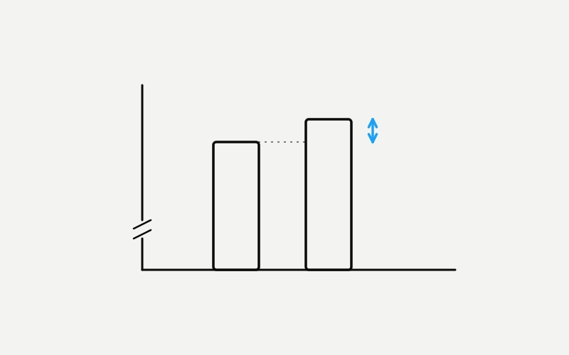
Then look at the axis. A bar chart that starts at sixty instead of zero turns a three-point gap into something that reads like a chasm. A radar chart with six or seven axes will almost always find at least one dimension where the new model wins comfortably, because with enough axes something usually sticks out in your favor. None of this is unusual or a sign of a particular lab behaving badly, it is closer to standard practice across the industry. But it means the visual impression a chart leaves and the actual magnitude of the improvement are two different things, and only one of them survives contact with your own workload.
'Significantly Improved' Is Not a Number
Watch for the unquantified superlative: significantly improved, dramatically better, substantially stronger. These phrases exist precisely because they let a reader's imagination fill in a number the lab is not willing to commit to in print. Sometimes that is because the real number is smaller than the improvement the last release claimed, so stating it plainly would read as deceleration. Sometimes it is because the gain only shows up on a favorable slice of an internal eval and does not generalize. Either way, an unquantified claim is not a fact you should accept, it is a placeholder that tells you exactly where to go looking once the post is over.
A useful habit is to treat every superlative as a question rather than a statement. 'Significantly improved reasoning' becomes: improved on which benchmark, by how many points, against which baseline, measured how many times. If a lab has the number and it is flattering, it publishes the number, because a specific figure is more persuasive than an adjective. The adjective shows up when the specific figure would not do the same rhetorical work, and that gap between what could have been said and what was actually said is often the most honest part of the entire announcement.
New Capability or New Coat of Paint?
Some of the most-touted launch features are not changes to the model at all, they are changes to the product wrapped around it. A longer context window achieved through retrieval and chunking behind the scenes gets described the same way as a genuine architectural increase in the model's native window, even though the two behave very differently under load. A new reasoning mode is sometimes a system prompt and a different sampling strategy applied to the same underlying weights, not a retrained model. A capability that appears multimodal at the product layer is sometimes a router quietly handing the request to a separate specialized model and stitching the answer back together.
None of that is a scandal. Product engineering is real engineering, and a well-built wrapper can meaningfully change what a model is useful for even when the weights underneath are unchanged. But the two kinds of progress compound differently over time, and they tell you different things about where the lab's research effort is actually going. The question worth asking is simple: is this change in the weights, or in the layer of software sitting on top of the weights? The release note will rarely answer that directly, but the phrasing usually gives it away once you are listening for it.
What the Release Note Chooses Not to Say
A release note is optimized to describe what got better. What got worse is disclosed elsewhere, if it is disclosed at all: a regression on a task category nobody thought to benchmark, a latency increase at longer context lengths, a narrower rate limit at launch than the previous model shipped with, a deprecation clock quietly starting on the model you already built a product around. These are not secrets exactly, they are simply not the story the announcement is telling, and a document only tells one story at a time.
This is why the model card or system card, when a lab publishes one, is usually more informative than the announcement post sitting next to it. It is also why the first two or three weeks after a release matter more than the launch day itself. That is when independent users start posting the edge cases, the regressions, and the workloads where the new model quietly underperforms the one it replaced. The announcement is the opening argument. The following weeks are the cross-examination, and the cross-examination is where you actually learn something.
The Demo Was the Best of Many Takes
The qualitative demos scattered through a release post deserve the same scrutiny as the quantitative charts, maybe more, because they carry an emotional weight numbers do not. A beautifully generated app, a clever piece of code written in one shot, a witty piece of writing produced from a short prompt: these are persuasive precisely because they feel like watching the model think in real time. What you are usually seeing is the best output from many attempts at the same prompt, sometimes lightly edited, occasionally run against a prompt crafted by someone who already knew which phrasing would produce an impressive result. None of that is illegitimate, showcasing your best work is what every industry does at a launch. But a single polished demo tells you almost nothing about the model's median performance on a similar task, and the gap between a launch demo and your own first attempt at something similar is one of the most reliable sources of day-one disappointment.
A useful discipline is to mentally multiply every demo by the number of times you would guess it took to get that result, then ask whether the underlying task is one you would actually attempt only once in production. Code generation, creative writing, and open-ended reasoning are exactly the domains where sampling several attempts and keeping the best one produces results that look nothing like what a single real user typing a single real prompt will get. The demo is real. It is also the best of many takes, and the release note will never tell you which take number you are looking at.
A Five-Minute Reading Habit Worth Keeping
Doing this well does not require a research team or a benchmark suite of your own, it requires five minutes and a short list of questions run against every release before you let it change your opinion of anything. Who is in the comparison chart, and is it the current, comparable version of that competitor? Is there an actual figure behind every superlative, and if not, why might that figure be missing? Is the headline capability something that happened inside the model or inside the product wrapped around it? And what is conspicuously absent from the cost, latency, and regression story that a full picture would include?
Pricing belongs on that list too, and it is almost never framed as a headline. A new model might be more capable per token while also costing meaningfully more per token, which is a reasonable trade-off but a different one than better and cheaper, which is how launch posts tend to imply every improvement works. Rate limits at launch are also worth checking against what the previous model offered once it had matured, not against that previous model's own day-one limits, since serving capacity for a brand-new model is almost always tighter at the start than it will be once a lab has had time to scale.
None of this means treating every release with suspicion or assuming the worst by default. Most labs are reporting real progress most of the time, and the habit described here is not about disbelief, it is about calibration. The purpose of reading like an analyst is to know, within a day of a launch, roughly how much of your world actually changed. Most of the time the honest answer is a little, incrementally, in a direction worth noting before getting back to work. The releases that deserve real excitement are rare enough that treating every one of them the same way only cheapens the ones that have earned it.